by B. McL
Everyone
knows what a map is. We use and see them every day, from a slick infographic on
the news, to the handy smart phone app we trust to get us correctly from A to
B. Or, for those outdoor adventurers we caller hikers, a crinkly old paper topo
map with hard to read text. But what about the science that comes behind these
maps?
Since the
Canadian government decided to map all its lands in the 1960s, we have called
that science GIS or, for the rest of us, Geographic Information Systems. Modern
day GIS is a science that deals, essentially, with representing the physical
world in a digital environment. Most basically, we choose to make this digital
world flat or round or somewhat egg-like, give it the fancy name “geoid”
(JEE-oyd), and then we stretch what we observe in reality to make it fit our 2-dimensional
(or more and more often 3-dimensional) model. This is what we call a
“projection”. Remember that for your next dinner party! The result is often a
pretty map, whose simplicity (or complexity!) says little about the databases,
projections, programming, surveying, etc. that it takes to produce it.
But GIS, or map making in general, hasn’t
always been so sophisticated. Or, rather, it was sophisticated in other ways.
While the maps of today are more often than not produced by satellites orbiting
our earth hundreds of miles above us, or by GPS-enabled survey equipment that can
pinpoint a location down to a fraction of an inch (at the cost of more than
your car!!!), all of which is fed into computers that runs programs with
thousands of lines of code, the maps of the past were often the result of
barebones surveying equipment that relied on star charts and fairly complex
trigonometry, and all taken down on paper that could easily be lost, burned, or
both. To see how accurately the cartographers of the past mapped our coastlines,
countries, and world, with nothing more than a sextant (or a length of chain!),
puts many of us modern day mappers to shame.
 |
| GIS Data Layer, Over-Lays |
So you may ask, “OK, so maps can tell us where we are, and how far interpret from that map. This is what we now call “spatial analysis”, and it affects us in ways we don’t even see, and in some ways we do.
away another place is, but that’s it, right?” Wrong. Maps can do so much more, and have done for hundreds of years. The way that a map can affect every one of our lives is what we
Here are a few examples, spanning the centuries and
sciences.
GIS and Public Health
The
godfather (not that kind!) of modern day spatial analysis, and of an often
linked science known the method used to find the
causes of health outcomes and diseases in populations; http://www.cdc.gov/careerpaths/k12teacherroadmap/epidemiology.html)
was a doctor named John Snow. Yes, like from Game of Thrones,
although arguably much more heroic (although less immortal). Doctor Snow was an
English physician in London during the mid 1800s. In many GIS and epidemiology
texts, he is rightly credited for his investigation into the cause of a cholera
epidemic in London in 1854. At the time, many doctors and public health
officials thought that disease was spread by “miasma”, or bad air. While we
know now that some diseases are indeed airborne, many others are spread through
media such as water. Dr. Snow wasn’t as fortunate as us to know about germs,
but he also didn’t believe that cholera as being spread through the air in a
toxic “miasma”. So he took to the streets, and with the help of a local
reverend surveyed the residents of the neighborhood in Soho where the outbreak
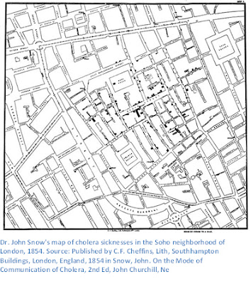
was worst. From his survey, he produced what many consider to be one of the
first recorded instances of spatial analysis. It was a map that tallied the
number of people who had become ill due to cholera. In the map, the black bars
represent individuals, and they are tallied up per household along each street.
 as epidemiology (which the US Centers for Disease Control
defines as “
While
somewhat hard to read, one can see that the bars are thickest at the center of
the map, on Broad Street. This was where the most sicknesses occurred, and this
trend let Dr. Snow to believe that the cholera was coming from a water pump on
Broad Street. We know today that cholera bacteria are transported primarily
through water, but at the time, Dr. Snow was met with much resistance from
local officials, although he did succeed in shutting down the tainted pump.
Consequently, the cholera outbreak was contained, and many people avoided
sickness thanks to his efforts. (Source: Gunn, S. William A.; Masellis, Michele
(23 October 2007). Concepts and Practice
of Humanitarian Medicine. Springer. pp. 87–. ISBN 978-0-387-72264-1.)
Today,
GIS is an integral part of public health planning and disaster response. During
the ebola epidemic of 2014-16, governments and public health non-profits used GIS
to analyze where
 |
| Source: http://www.who.int/csr/disease/ebola/maps/en/index1.html |
outbreaks were worst, and where they might be heading. This
allowed them to prioritize resources to the heaviest hit areas, and ultimately
contain the epidemic, although at a high cost in lives. Without the
visualization provided by GIS, decision makers would have made blind decisions,
which could have extended the epidemic. The map below uses “graduated symbols”,
or symbols that get bigger or smaller depending on what they represent, to show
the number of ebola cases in different districts of Guinea, Liberia, and Sierra
Leone in West Africa. By comparing the size and color of the symbols, they
could see where ebola cases were decreasing, and where they were increasing.
GIS and the Environment
GIS has also provided a
great many benefits to the managers of our world’s natural resources. All over
the world, changes are taking place to the environment that will affect life on
earth in many different ways. GIS has been used to map and predict sea level
rise due to global climate change, identifying areas that will see the most
inundation, and giving people in those areas more information they need to
prepare and adapt.
 Maps
have also helped forestry managers right here in the US identify where forests
are struggling to survive due to drought, tree-killing beetles, and other
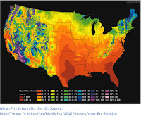
threats from a changing climate. The map below shows how often fires occur in different
parts of the US, which will help forest managers make decisions about where to
apply fuel-suppressing treatments (burning dead wood to reduce the risk of
fire) or other strategies to revitalize dying forests. Forest fires can affect
millions of Americans with bad air quality, destruction of infrastructure and
homes, and also contributes greenhouse gases to the atmosphere.
GIS in Local Government
 |
| Chinese Holy Field Plan |
While
not the most glamorous or the most global in perspective, GIS used in local
government often has wide ranging effects on where, how, and how well we live
day to day. City planners have been literally deciding where we live for
centuries, and their decisions are informed and enforced by maps. In ancient
China, cities were often laid out as a representation of the Holy Field, which
was a philosophical concept related to numbers. In the modern day, new
philosophies inform how people and activities are grouped together. For
example, it is often desirable to keep heavy industry away from residential
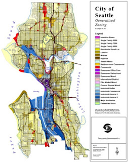
areas or environmentally sensitive areas such as wetlands or streams. Many
cities and counties adopt zoning rules which decide how land is used, although
there are many notable exceptions around the world (or better or for worse! I’m
looking at you Houston!).
 GIS analysis of traffic patterns and public transit
use helps governments plan out road, bus, and rail expansions. As traffic is
one of the biggest headaches in the lives of most Americans, imagine how bad it
might be if we had no idea where the clogged routes are, and where the alternatives
lie. GIS enables informed decision making.
Citizen GIS
We’ve
covered a few different ways GIS is used to better our lives. Be sure, there
are many more, and probably a few not-so-good ways as well. If you made it
through all this, you might think, wow, GIS is very exciting, but too hard for
me to understand or contribute to. That is where you are wrong! There a variety
of ways that any citizen with a smart phone or a computer can contribute to the
field of GIS, for the betterment of all life on earth. Here are just a few:
·
Open Street Map. OSM is “the Free Wiki
World Map – An openly licensed map of the world being created by volunteers
using local knowledge”. Anyone can quickly and easily learn how to add to the
map. Add your house, or different features around your neighborhood such as
trails, parks, restaurants, etc. https://www.openstreetmap.org/
·
Missing Maps: This program, founded by
the Red Cross and others, directs the improvement of Open Street Map by
targeting where maps are missing in the world’s most vulnerable places and
recruiting citizen mappers to improve them, from the comfort of your own home! http://www.missingmaps.org/
·
Find It Fix It: Find It Fix It is a public
service request app by the City of Seattle. Many cities and counties have
similar apps downloadable on the Google Play or Apple store. Find out if your
city has a similar map app, and start helping to improve the area you live! https://play.google.com/store/apps/details?id=gov.seattle.searequests&hl=en
·
What’s Invasive: What’s Invasive is an app
that turns you into a citizen scientist! You can report where you observe
potential invasive species, help managers respond before it is too late! https://play.google.com/store/apps/details?id=edu.ucla.cens.whatsinvasive
·
For other crowd-sourced apps and websites, see this article: https://www.scientificamerican.com/article/8-apps-that-turn-citizens-into-scientists/


Brilliant! This was fun *and* informative! ;)
ReplyDelete